Gemeente Den Helder
-- 2022
Research
UX design
UI design
Research
UX design
UI design
-- Situation
The existing website of the municipality of Den Helder did not meet the accessibility guidelines as stated by the WCAG, with complications mostly existing for people using screenreaders.
This redesign was unsolicited, which took place in a span of 2 weeks, with the end goal of getting the main problems clear, and proposing a solution.

-- Problem
People with visual impairments navigate through websites guided by a screenreader. In order to understand the structure and levels of the page, the screenreader will also read aloud the tag elements, such as the levels of heading, before reading the actual heading.
The second goal we aimed for, is that we wanted our product to stimulate children to think ahead, use their curiosity and their want to be involved with others.
Besides this, the navigation structure proved to be chaotic for users, as was the case during the orientational testing of the existing website.
But most importantly in terms of accessibility, the accessibility tool provided by the website was not easily available, and fell behind other contents of the navigation bar.

-- Action
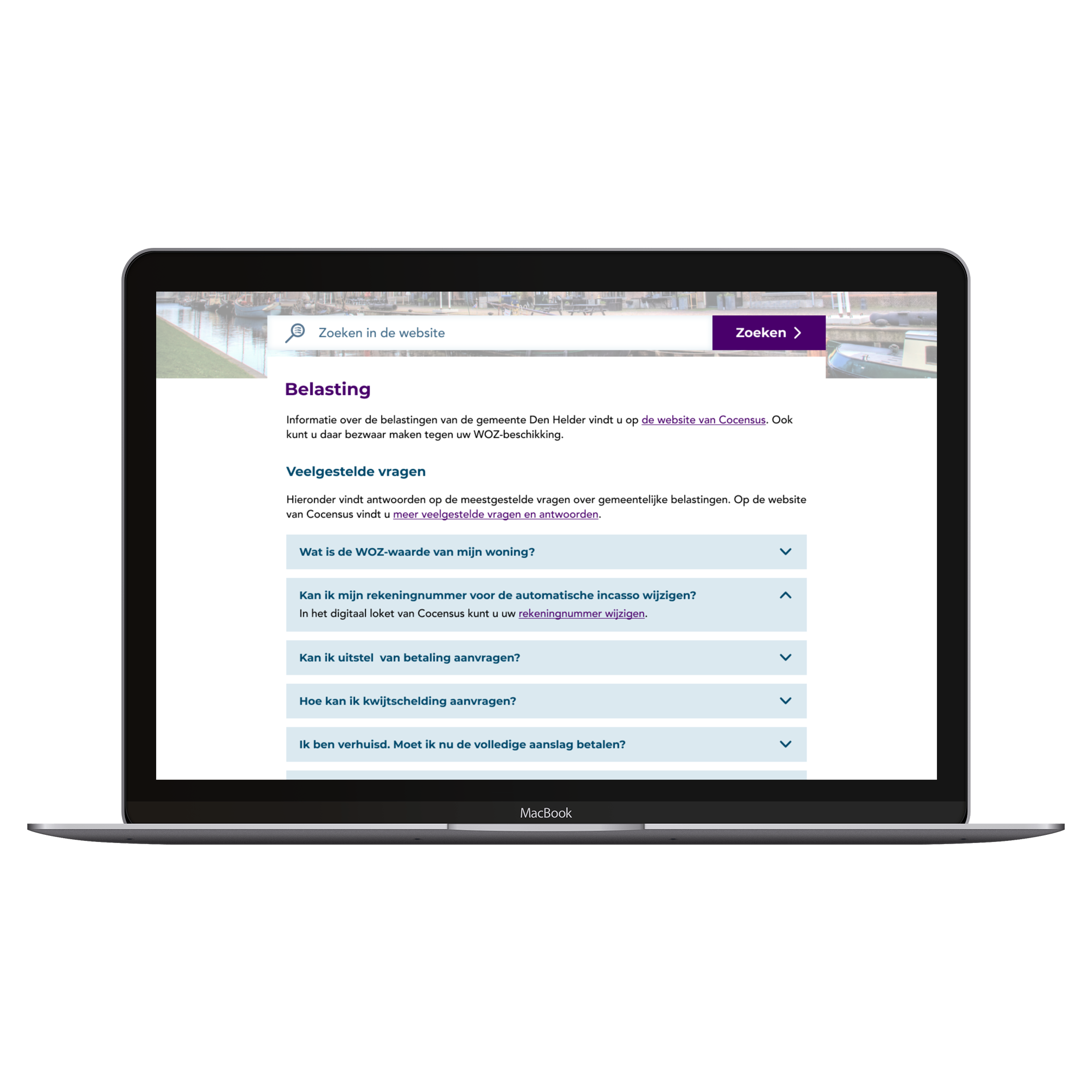
For the redesign regarding the content, the focus was set on making information easily findable. The original list of all subjects available (containing 14 items) was sorted alphabetically, which would mean having to skip through 13 irrelevant subjects in order to arrive at zorg’ ((health-)care).
After consulting with Ottiya for the details on building the educational approach, we developed an interactive prototype in Figma. To conclude our project, we reached out to an after school care faciility, which helped us incredibly with validating our ideas.
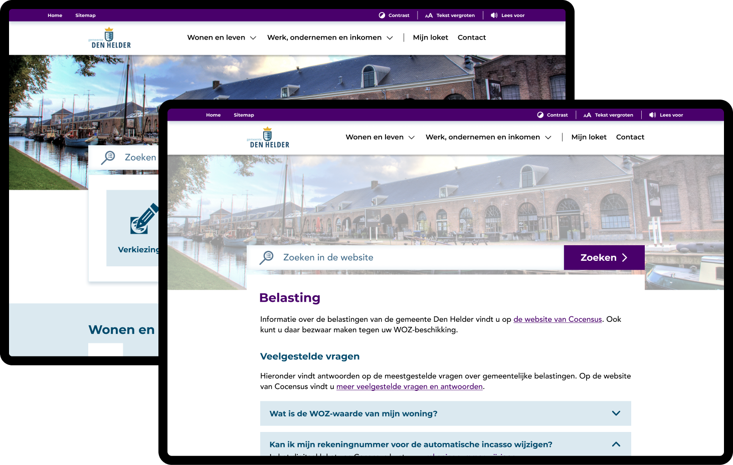
To make the accessibility features more accessible initially, these will be displayed in a seperate header.
-- Result
We divided the subject overview on the homepage into different themes, as to make it easer to skip to the theme relevant to the subject the user is looking for.
Further, the accessibility features will be available constantly, also after scrolling in a high contrast header with clarifying icons.
During the process of redesigning, we constantly checked for contrast accessibility for all the types of color blindness.